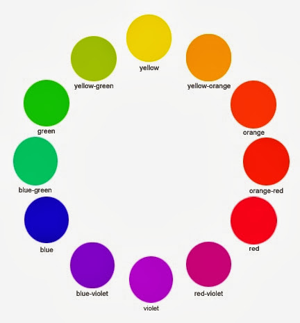
The color wheel helps us visualize some important color concepts: ANALOGOUS COLOR, COMPLEMENTARY COLOR, WARM COLOR, COOL COLOR. Also PRIMARY, SECONDARY, and TERTIARY color.
Much of the color we see in life and art is less SATURATED (intense) and darker or lighter than the pure hues of the color wheel and the spectrum.
In the chart above, The first row shows primaries, secondaries and tertiaries at full saturation.
The second row shows pure red (center) tinted with white and shaded with black.
The third row shows pure red (left) toned down (muted) with progressive amounts of grey.
Bougereau, 19th century. In Renaissance and classical painting traditions, SATURATED HUES tend to be used sparingly, saved up for choice moments in the image. This is partly due to a desire for realism/naturalism. Also, it would have been difficult/costly to obtain enough pure red/yellow/blue etc. pigment to make a large painting that used a lot of pure/saturated color. Earth colors (muted colors) are cheaper. That's still true today.
Decorative, saturated color
An earlier historical example of saturated color employed for
decorative purposes; for the sheer pleasure of intense color.
A post-impressionist seeing the world in terms of small points of saturated color. This is "optical color" taken to the extreme.
Vincent van Gogh. EXPRESSIONIST COLOR. "Unnatural" saturated color used for expressive purposes (conveying the artist's deep feelings). This approach to color had never been seen in Western art and was very influential on 20th century painting.
Artist: Romare Bearden. COLOR: HARMONIOUS, ANALOGOUS color. Most of these colors are from the same (blue/purple) family, though some hues are more SATURATED than others. There are some small accents of "hot" color from across the wheel for contrast.
PRINCIPLES of DESIGN: the wide variety and direction of curved shapes and the strong diagonals make this a very ACTIVE image. The harmoniousness and QUIETNESS of much of the color serves to counterbalance this effect: if the colors were wild and contrasty, the image would be quite chaotic.
Milton Avery. "Unnatural" saturated color used for expressive and/or decorative purposes. An example of the freedom with which 20th and 21st century painters often use color.
A painting in all muted tones (as opposed to saturated pure hues). Even though the color is muted, we can still see a strong warm/cool contrast in this painting.
Milton Avery. The most saturated color is employed for the baby's face, emphasizing the newness and vitality of the child. Freedom from "realistic" color sometimes allows the artist to convey information more clearly.
Peter Saul. Extremely saturated color used throughout the image, creating jarring contrasts of color.


